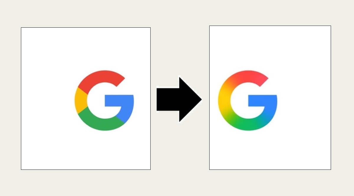
Google has launched a refreshed version of its iconic ‘G’ logo, marking the most significant design change in nearly a decade. The updated logo swaps the previous segmented look for a smooth, continuous gradient that seamlessly blends the brand’s classic red, yellow, green, and blue colors.
As reported by 9to5Google, the new logo is currently rolling out on iOS via the Google Search app and is also appearing on Android through the beta version (16.18) of the Google app.
This is the first major update to the ‘G’ logo since 2015 and reflects Google’s evolving visual style. The new gradient design is in line with the look of newer products, such as the AI assistant Gemini, which features a similar gradient aesthetic.
For now, the redesigned logo is visible on iOS and Pixel devices, while the older version remains on the web and non-Pixel Android phones. A broader rollout is expected in the coming weeks.